Healthcare SaaS · Georgia · 0 → 1
Five products. One regulated core.
A healthcare SaaS ecosystem built in Georgia: five products, five industries, one platform core, four co-founders. I owned product and design across all of it. This is the story of three structural decisions that made five markets possible for four people.
- ROLE
- Co-founder & Founding Product Designer
- WHEN
- Jan 2025 – Jul 2026 · Tbilisi, remote
- TEAM
- Four co-founders · no researcher, no QA, no design team
- SCOPE
- Product direction · research · IA · design system · every interface
- PRODUCT
- medx.ge
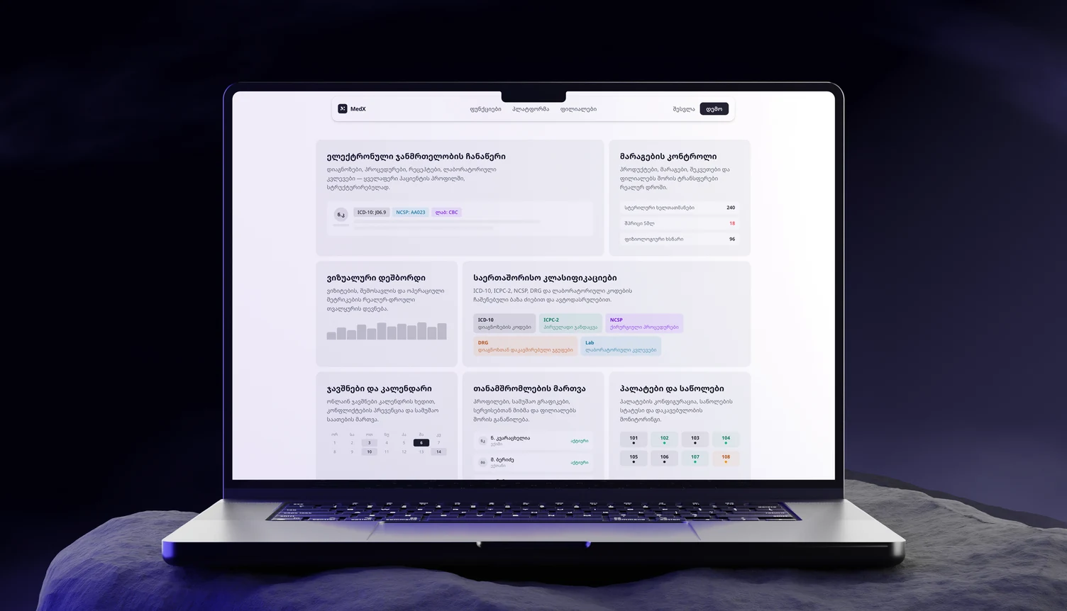
/01 — the situation
A booking app is a roof on a building with no floors.
A Georgian founding team had a working prototype and a market they understood from the inside. What they did not have was someone who had built healthcare software to European product standards. They approached me to join as co-founder and own product and design.
What existed on day one was an early mobile prototype: doctor-visit booking and a patient profile. It rested on an assumption that turned out to be false — that the clinic on the other end already runs on something. In the clinics we were building for, it didn't.
Georgian clinics must produce and upload digital patient health records in a defined structure. Every option on the market covered part of that job, so clinics ran two or three tools plus paper and reconciled by hand — re-entering the same patient data into a government portal at the end of the day, in a second format. This was never a convenience problem. It was a compliance problem that software had failed to solve, and every clinic was absorbing the failure manually.
Four causes compounded. Existing software covered part of the job. The state required upload in a defined structure. The international alternatives had no Georgian interface, no local support and foreign-currency pricing. And regulation governed the records themselves — how they are kept, what they must contain.
Stated that way, the product it implies is a different product. Not a nicer interface over the same workflow. A system where the record is born in the right shape. That reframing was the first real decision of the project, and it happened before a single screen was drawn.
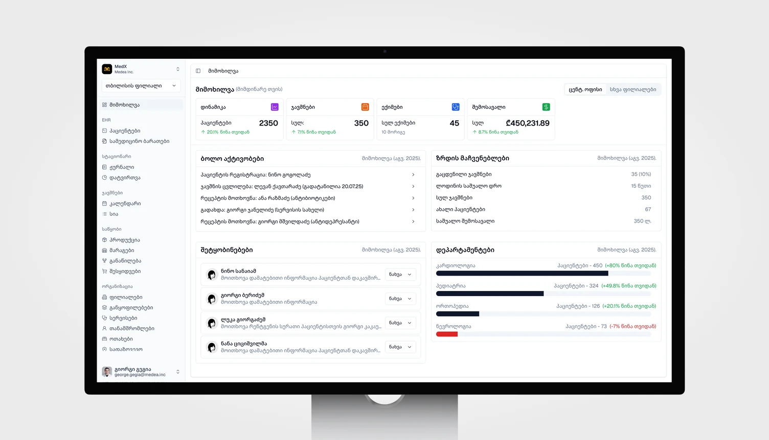
The market was fragmented rather than empty: competitors existed, none covered the whole job. We were not displacing a system, we were consolidating two or three of them plus paper — which made feature completeness a condition of entry rather than a differentiator.
/02 — my role
Product and design, end to end.
I was one of four co-founders and the founding product designer. I owned product direction and design across all five products: the research, the information architecture, the design system and every interface. There was no researcher, no QA and no design team.
I led the research across four verticals, with 13+ competitors profiled each quarter, nine documented personas and the regulatory mapping of coding standards and reporting obligations.
/03 — the turning point
We came to research waiting lines. We found clinics running by hand.
We went into five partner clinics to research the prototype's problem — patient registration, the long waiting lines. What I kept seeing instead was the admins at reception working manually.
That raised the question that broke the brief: if the clinic runs on paper, where would the app's digital health records come from? We re-analysed the problem with a wider scope and found the real gap — clinics had no effective software for digital health record processing at all.
This is the moment the project stopped being the one I was hired for. Everything after it — the data model, the platform core, five products instead of one — follows from a reception desk, not from a strategy document.
/04 — market & the law
500+ clinics, and not one complete solution.
From the partner clinics we mapped the software actually in use and analysed each one against the job. No single product covered all the gaps at once — every option was missing something a clinic needs. Then the market signal: those same solutions were serving 500+ clinics in total, which meant every one of those clinics was living with the same problem.
What had walked in as five clinics' pain resolved into a market-wide gap.
August 2025: the gap became a legal obligation.
Diving deeper surfaced the stakes — in August 2025 Georgia implemented a new law obliging clinics to keep a digital health record for every patient and upload it to the government's regulatory portals. Clinics were absorbing that obligation by hand: two or three tools plus paper, re-entered into a portal at day's end.
The date matters as much as the law. A compliance gap that recent is one the incumbents had not caught up with either — which is the whole reason the timing was right for a new entrant rather than a better feature.
/05 — research
Access to a Tuesday morning at a reception desk.
The reframe then got a full research program behind it: 13+ competitors across four verticals refreshed quarterly, nine documented personas, regulatory mapping of coding standards and reporting obligations — and more time inside the clinics, shadowing and interviewing quality managers, doctors, administrators and nurses.
We had that access because one co-founder had spent his career inside Georgian clinics and taken two of them through international accreditation. That is the difference between designing from a persona document and designing from a Tuesday morning at a reception desk.
Three findings that changed the design
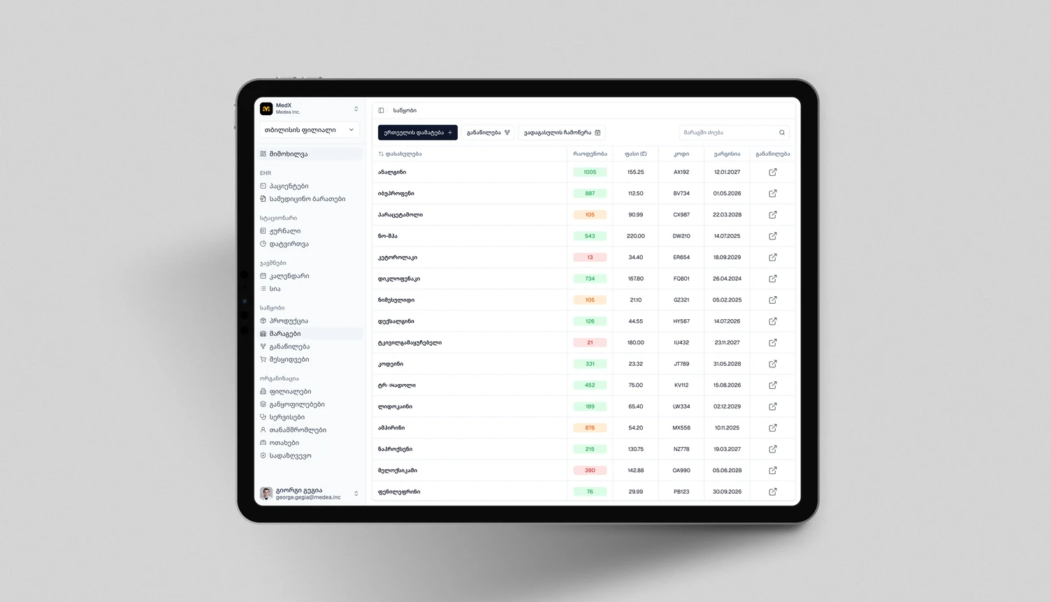
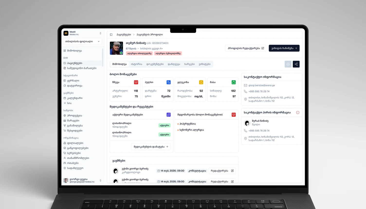
- The administrator opens the system dozens of times a day. Patient search is not a feature, it is the hero flow — and everything else in the interface is arranged around it.
- For veterinary practices, expired stock is direct cash loss. Not an inventory inconvenience: money on a shelf turning into waste. That became VetX's sharpest wedge.
- Owner-vets decide in days, not months. Which changes the shape of the sales motion, and therefore what a demo has to prove in its first two minutes.
Channel research mattered too: Facebook accounts for roughly 86% of Georgian social-web traffic, which is why Messenger became a designed sales surface rather than an afterthought.
/06 — strategy
The regulator had already written the data model.
The government portal defines the obligatory patient-health-record forms and fields — what must be captured, in what structure, for a record to be valid. That specification already existed, and every clinic in the country was already required to satisfy it. So we built the core on those regulated structures and reused them across every product.
Compliance became native rather than bolted on: the record is created in the shape the state requires, so there is no export-and-reformat step at the end of the day, because there is nothing to reformat. The data model also arrived pre-validated — we did not have to invent an ontology for clinical records and hope it survived contact with a real clinic.
And it ports. A regulated backbone for patients, visits, records and reporting carries into veterinary, dental and aesthetic practice with a thin vertical layer on top. That is what made five products arithmetically possible for four people.
Build on the government's record structures
Capture clinical data once at the point of care, in the regulated structure, and reuse it for state reporting.
- CHOSE
- The regulator's data model as our core
- OVER
- Manual export at reporting time — what the incumbents do
- COST
- Deep coupling to a state system we do not control; if the portal's requirements change, our data model changes with it
/07 — one core, five products
Four people cannot win five markets by building five products.
The core carries records, scheduling, inventory, billing, analytics and multi-branch organisation. Each vertical adds a thin specialised layer: an inpatient journal and bed occupancy for clinics, prophylaxis and vaccination reminders for veterinary, per-specialist commission reporting for salons.
The same discipline runs through the design: shared tokens, one type scale, one spacing grid, one component set. A product may change its accent colour, canvas temperature, display face and photography. It may not change the scale, the spacing, the component shapes, the breakpoints or the wording structure.
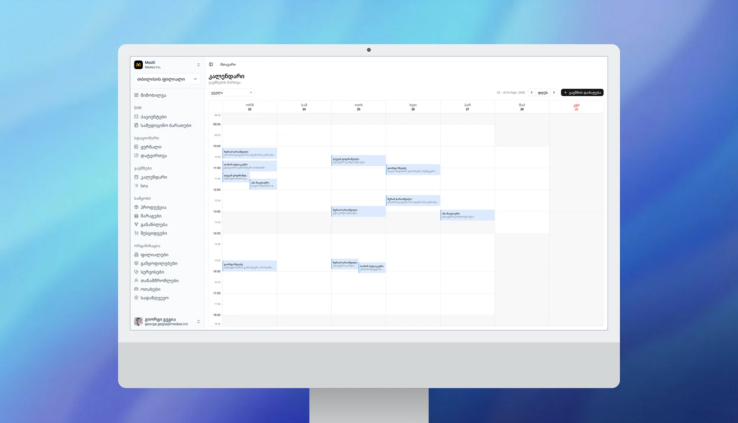
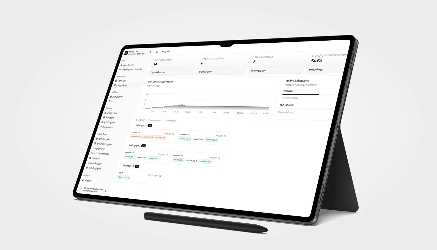
One core, five vertical specialisations
One system with five skins, rather than five products that happen to look related.
- CHOSE
- One platform core, five vertical products
- OVER
- Five independent products
- COST
- Every core change ripples across five surfaces — no change is ever local, and regression thinking becomes a permanent tax
Governance follows from that: if a product needs a component the core does not have, it goes into the core first. Every such request is a decision — a local fix ships this week and fragments the system, or the component enters the core, takes longer, and benefits all five products.
The umbrella brand was designed in full — architecture, naming, endorsement model — and then deliberately held back, gated behind stable paying bases, three products live, trademark clearance and the bandwidth to roll it out properly. Unifying too early means paying a branding tax while still hunting first customers.
/08 — designing in three scripts
Georgian sets the breakpoints, because Georgian wraps first.
Mkhedruli runs roughly 35% wider than Latin at the same size, with a smaller x-height. Headlines break earlier. Buttons read smaller at equal numbers. A measure that runs five lines in English runs seven in Georgian. That is not a translation issue — it is a layout constraint, and it has to be designed around from the first artboard or every screen gets rebuilt later.
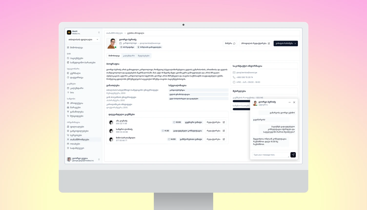
So the rules inverted: budget an extra line against the English draft, bump Georgian button text so it reads at parity with Latin, widen the measure for intro paragraphs, and test every breakpoint in Georgian rather than English. The method is script-agnostic: set the type scale per script, take the breakpoints from the widest one, and let the measurement — not the English draft — decide.
Localisation is infrastructure, not a content task. Every translatable node carries a key, and a CI check fails the build if a single untranslated string survives a language switch. It has caught real bugs four times.
Contrast was measured rather than eyeballed. One accent per product, each verified: all product accents clear 4.5:1 on the dark panel, ink-on-accent runs 5.83–8.21:1. Accessibility to WCAG 2.2 AA — including the requirement most teams miss, UI borders at 3:1, which is what makes an input actually findable.
AI ran inside the production pipeline for prototyping and system production. Not a novelty: it is the reason a four-person team shipped at this rate.
—
baseline
—
Measuring the widest label in each script, live in your browser.
/09 — what adoption changed
Everybody was looking at everything.
Acquisition and onboarding ran through personal meetings — no self-serve funnel, no free-trial flow. In a market where B2B trust is built face to face, someone sat down with each organisation. That is slower, and it is also why we saw exactly how the software met reality.
Watching real clinics use the system, one thing was obvious: a nurse, an administrator and a director were all being shown the same interface, and all three were paying a cognitive tax for the parts that did not concern them. We introduced roles and permissions — access split by staff type, so each role sees only its own job. Fewer options on screen, less to learn, less to get wrong, and a side benefit that matters in healthcare: access to patient data narrowed to the people who need it.
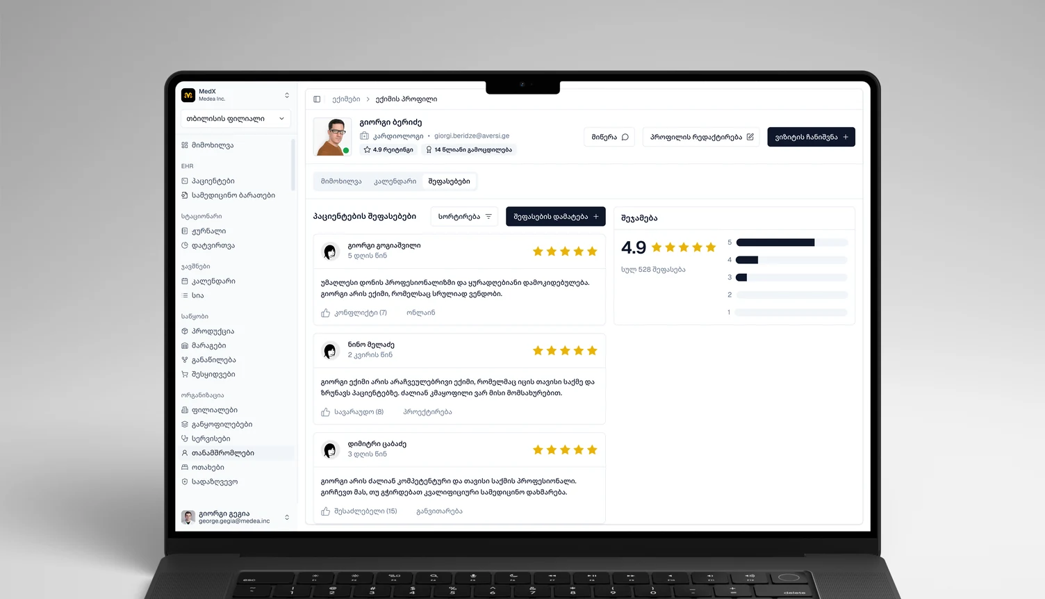
| Capability | Owner | Specialist | Reception |
|---|
The brand stops at the login.
The one-core rule exists as variables. In the brand style guide every product owns three values: a signature colour and two neutrals. Ink, type and shape come from the core and are the same for all five. Behind the login there is no accent at all: MedX, VetX and CosmetX run on one set of 32 semantic tokens, where VetX and CosmetX match on all 32 and MedX on 26.
BRAND · EACH PRODUCT OWNS THREE
BRAND · SHARED BY ALL FIVE
APP · ONE VALUE IN ALL THREE
The system starts from shadcn/ui and extends it. The engineers build the apps in Claude Code on shadcn, so the app core speaks its semantic set: background, primary, border, sidebar and the rest. We added what the base does not have: a brand layer, in which each product gets a signature colour and two neutrals. The rule that joins the two layers is the design work. A product owns its three brand values, and the core’s names and values belong to all of them.
The six values where MedX differs are its five chart colours and its error red. It also sets the navigation at 13px, where the other two use 14px.
/10 — outcome
Five products, three of them in daily use.
At the end of my tenure the products were in test phase — clinics and salons running them on test accounts in daily operations, not as trials on the shelf.
CosmetX carries the most accounts despite launching last, for a market-access reason rather than a product one: there are far more beauty salons than medical clinics in Georgia, and they are considerably easier to reach — the decision-maker is usually the owner, often working the floor, and reachable directly. Conversion from test accounts to paying contracts was the next milestone.
At Geocon I saw what it costs when an ecosystem fragments over years and has to be consolidated after the fact. Medea is where I made sure one never could. The work this proves is the senior part of the job: changing the question when the brief has the wrong one, making structural trade-offs and owning their costs in production, and building the system that lets four people ship like forty.