Healthcare & workforce SaaS · Germany
Two suites. Nine core applications.
Two companies with decades of their own history came together as one, leaving overlapping products that solved the same problems in different ways. I led the design that consolidated them into two software suites — Cairful and Timeful — and nine core applications.
- ROLE
- Senior Product Designer
- WHEN
- Aug 2024 – May 2026 · remote
- TEAM
- Cross-functional team of 12 · 4 designers mentored
- SCOPE
- Audit · research · design system · web migration · rebrand
- SCALE
- 5,000+ organisations · 12 countries
- PRODUCT
- geocon.de·cairful.com
/01 — the situation
A merger left two ecosystems solving the same problems twice.
Geocon has served the German care sector for 27 years. It came together with Cairful — two previously independent companies, each with decades of its own history — and the result was two parallel product ecosystems: overlapping functionality, duplicate features, conflicting workflows, and customers who often used applications from both portfolios in the same working day.
The customers are the organisations that carry German care: Caritas, Diakonie, AWO, DRK, Korian, Alloheim. In a nursing home the same shift is planned by a manager on a desktop, staffed by a nurse holding a phone in a corridor, and documented on a tablet at the ward station — inside rules neither of them can negotiate. Cairful covers care documentation, scheduling, billing and controlling; Timeful is the open workforce-deployment system alongside it.
Fragmentation of this kind is rarely a visual problem first. Each application had its own answer to the same recurring questions: how a person is searched for, how a list is filtered, how a status is confirmed, what happens when something is overdue. Staff moving between applications carried none of their learning with them, and every new feature had to re-decide problems the company had already solved somewhere else.
There was also a commercial edge to it. Care organisations buy suites, not screens; a platform that behaves like nine separate products is harder to sell, harder to train and more expensive to support — a cost paid every day, quietly, by everyone.
/02 — my role
Audit the whole portfolio first. Then go and watch the work.
My first objective was to understand the ecosystem at a systems level. I ran a full product audit across the whole portfolio, mapping user journeys, feature sets, workflows and technical dependencies — and the pattern was unambiguous: the products solved many of the same problems in different ways.
That insight changed the scope of the work. Instead of treating each application as an isolated product, I repositioned the portfolio as a connected ecosystem — one experience that could carry existing customers and still leave room to grow.
Then I went to the work itself. Geocon had shipped successfully for 27 years on domain expertise and customer proximity, but never with structured user research. I ran field research inside our testing clinics and care facilities, observing care staff, administrators and coordinators through their daily routines. What surfaced were inefficiencies, workarounds and unmet needs that stakeholder interviews had never shown: excessive navigation, duplicate data entry, and manual processes so old they had stopped being visible as problems.
Those findings became the basis for both product improvements and entirely new features, prioritised around reducing cognitive load for people working fast, with little time and very mixed technical confidence.
The other half of the job was upward. At this scale design decisions are roadmap decisions — what gets unified first, what stays untouched, what a customer feels in the next release. I worked directly with the executive level so those trade-offs were made once, deliberately, rather than re-negotiated per feature.
Inside the team I mentored four designers, two junior and two mid-level, and worked daily in a cross-functional team of twelve: developers, product managers, designers and QA.
/03 — care documentation
Documentation has to survive the corridor, not the demo.
The Cairful side is used during care, not after it. The design problem is not richness — it is how few actions a task can take when the person doing it is standing up, holding a phone, and being interrupted.
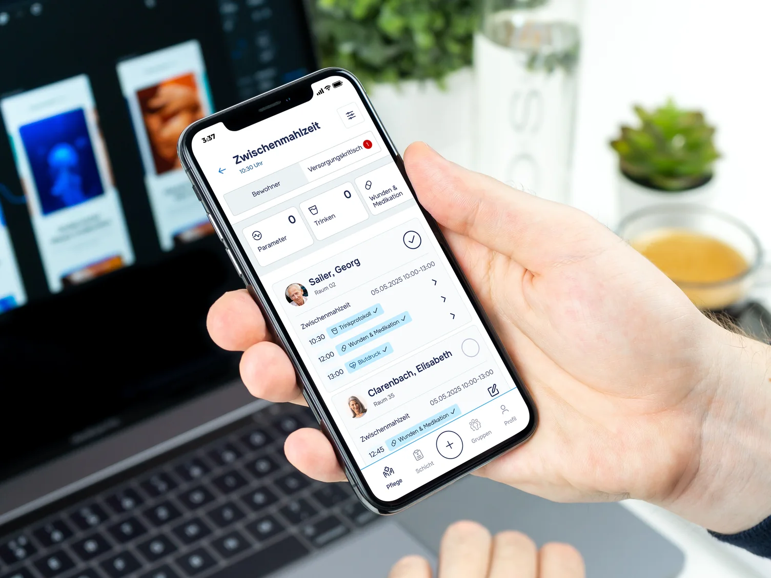
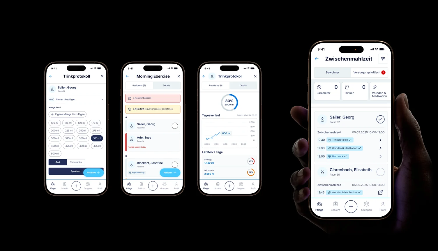
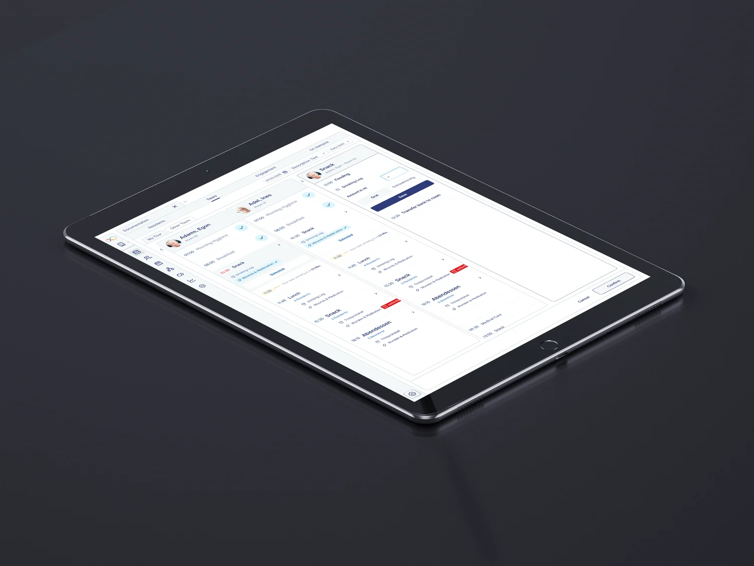
Every entry in these screens is a record someone can be asked about later. That pushes the interface toward explicitness: amounts chosen rather than typed, oral versus intravenous stated, an entry confirmed and timestamped rather than silently saved. Speed comes from removing steps, never from removing the record.
/04 — shift planning
Planners don't want simpler. They want denser, and readable.
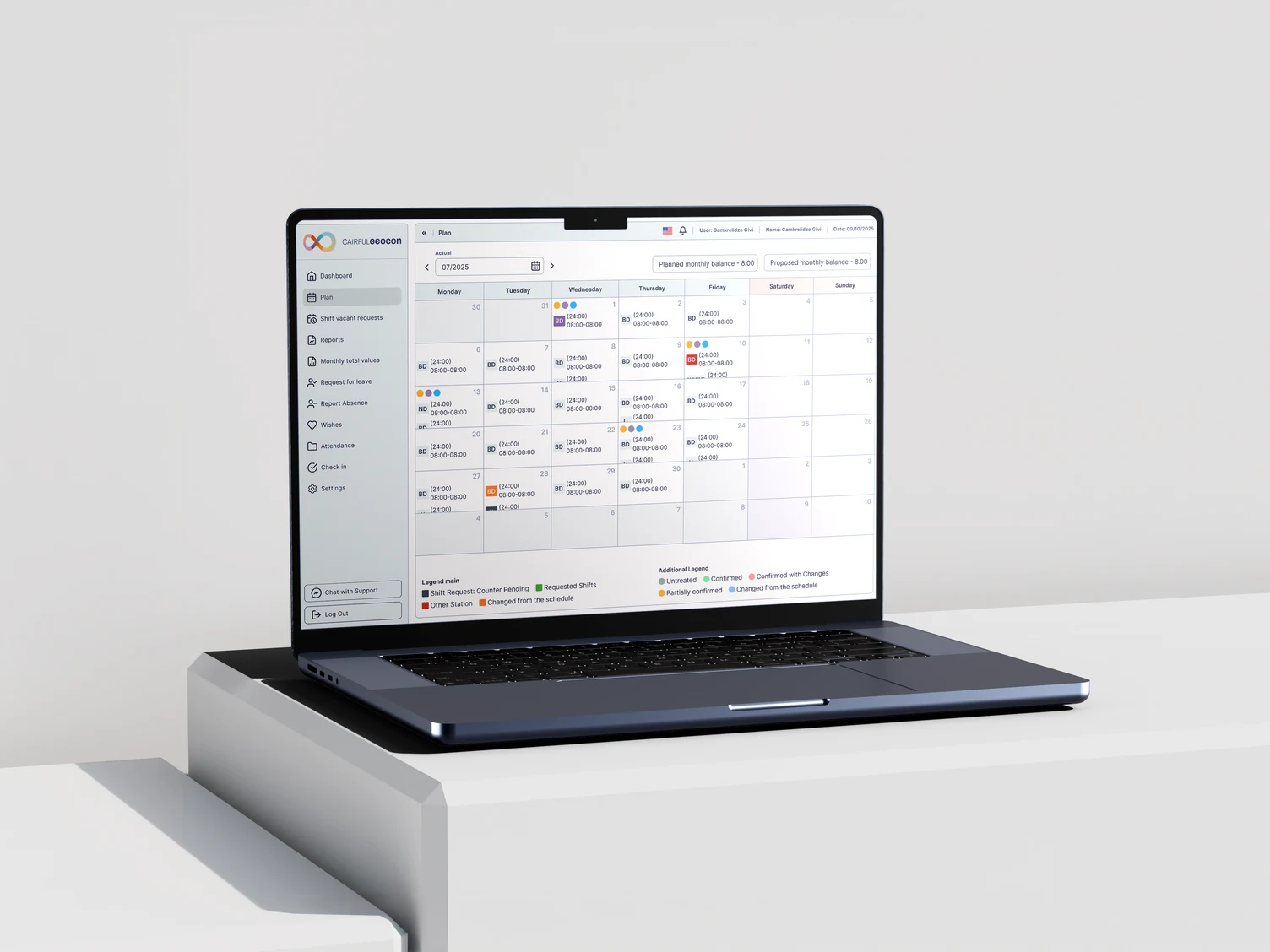
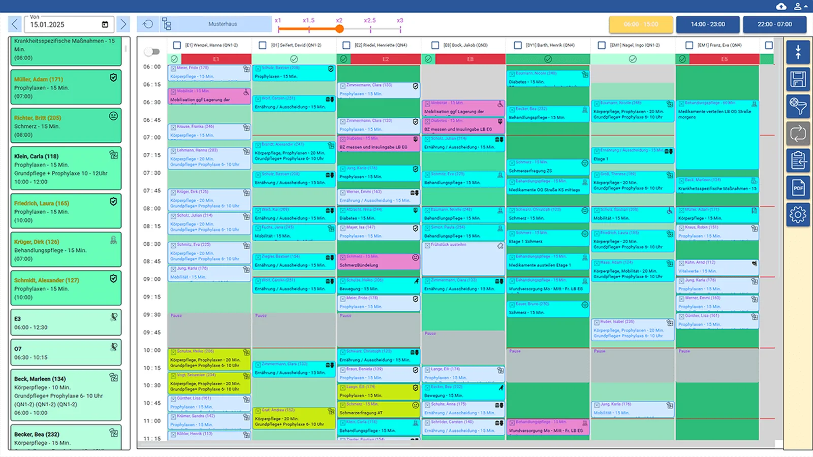
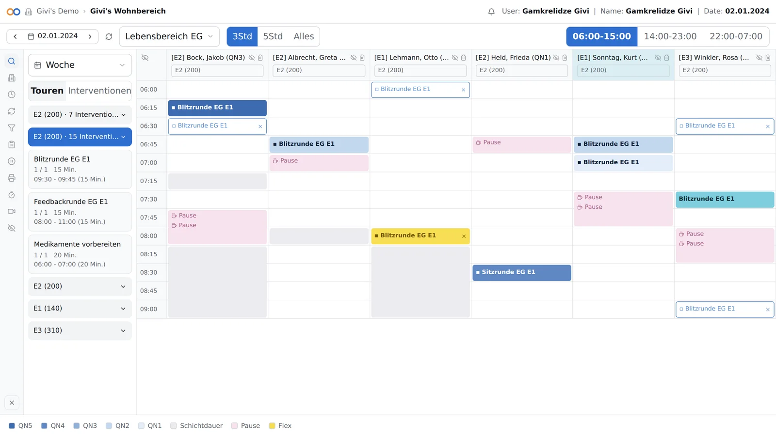
Timeful is the other extreme: a month of shifts for a whole care home, on one screen, edited for hours. Here the temptation to "simplify" is exactly wrong — the work is comparison, and comparison needs density.
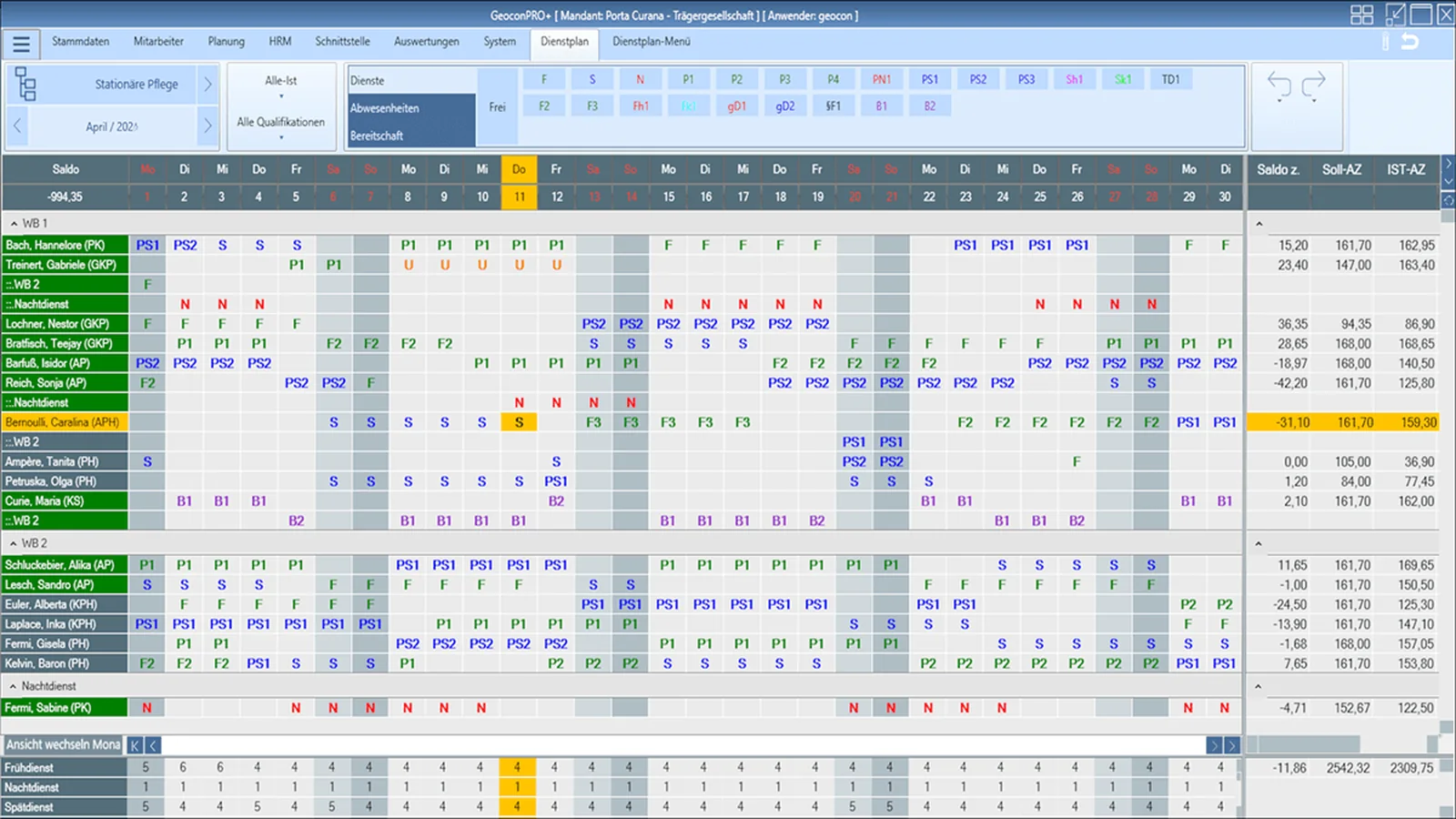
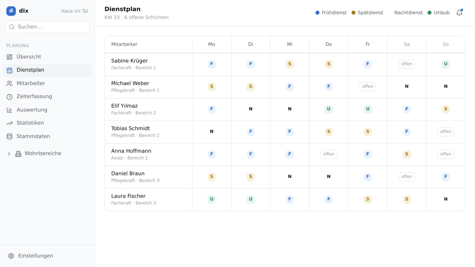
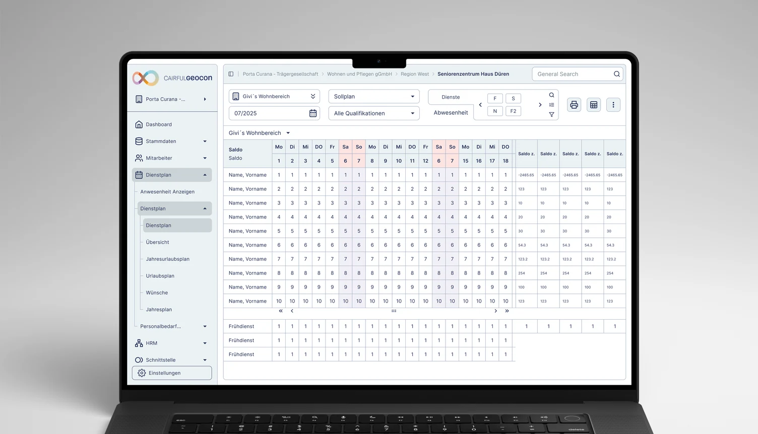
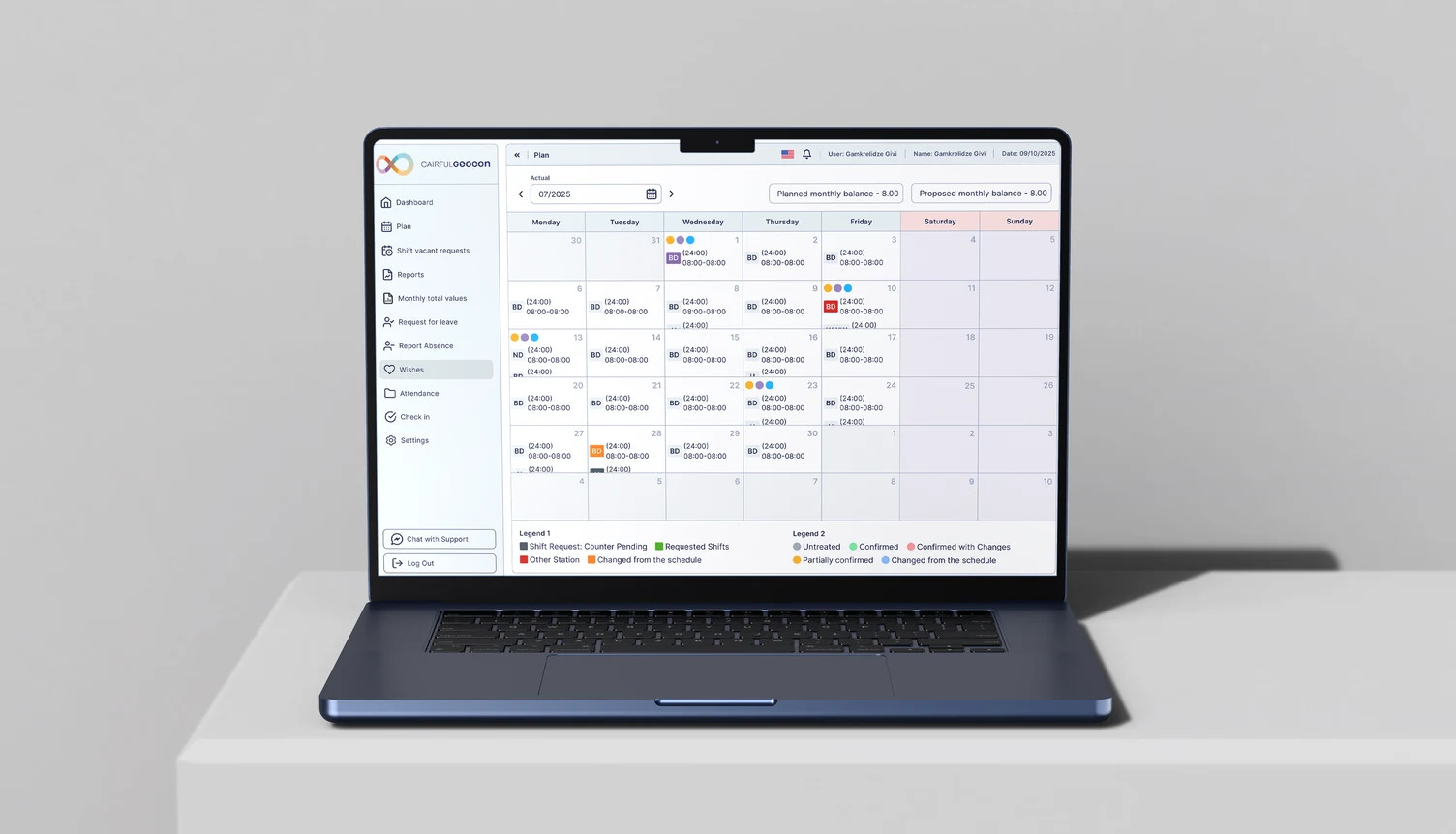
Two audiences, one dataset, opposite needs: the planner optimises coverage across a whole house, the employee wants to know what their next four weeks look like and whether their wish was accepted. Splitting them into separate mental models would have doubled the maintenance; sharing the model and changing the density was the cheaper and more honest answer.
/05 — the migration
1,500 local installations, moved onto the web.
Organisations were running physically installed software — setup, maintenance and device-bound access, with the overhead landing on customers and support alike. I led the design of the move to a unified web and mobile experience: sign in, and the applications are there, on any device.
This is the part of the project with real operational risk attached. These are live systems inside care homes; the migration had to preserve what administrators, nursing staff, schedulers and operational managers depended on while removing the installation barrier entirely. Getting it wrong would not have been a design problem — it would have been a shift that could not be planned or documented.
It is also what made everything else compound: once the ecosystem was reachable from anywhere, one design system across it produced one experience rather than twelve local variations of one.
/06 — the design system
One system, applied to work that has nothing in common.
The unification was not a visual refresh. I designed and implemented a shared design system spanning both suites — a common visual language, interaction patterns, a component library, accessibility standards and a design governance model. For the first time customers experienced the portfolio as one ecosystem rather than a collection of disconnected tools.
Colour, type, spacing and elevation became variables rather than decisions. Search, filtering, confirmation, overdue states, destructive actions and history were specified once and reused. The visual language was pulled tight enough to be recognisable across two brands, and loose enough that a documentation app on a phone and a planning grid on a desktop could both use it without pretending to be the same product.
The governance model is the part that outlives me: not the components themselves but the rules for how the tenth application gets designed — who decides, what gets promoted into the core, and what a team is allowed to solve locally.
The rebrand rode on the same rails and shipped publicly at Messe ALTENPFLEGE in Essen in April 2026 — the point at which the system stopped being an internal argument and became the face of the company.
Unify the interaction model, not the interfaces
The fastest visible win would have been a single skin over everything. The durable one was slower and less photogenic.
- CHOSE
- One shared model — tokens, components and interaction rules under both suites
- OVER
- A visual refresh applied application by application
- COST
- Slower first release, and every later change has to hold for nine applications at once
/07 — the interface, up close
Six levels deep before a nurse writes anything.
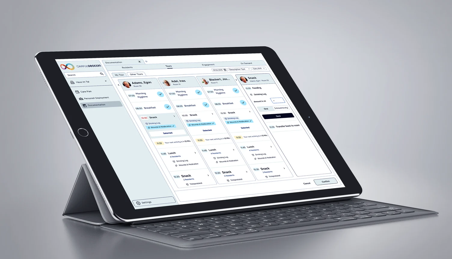
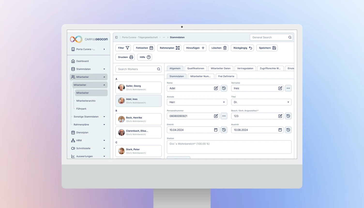
Care documentation is a hierarchy problem before it is a screen problem. A record sits at the end of a route through provider, house, living area, area, resident and care plan — and the software has to make that route feel like one place rather than six.
Forty-two names, three skins.
Underneath, the system is three collections of Figma variables. 148 primitives hold raw values and mean nothing on their own. 42 tokens name a job (text, surface, border, icon, spacing, radius, text size) and each one points at a primitive. A further 51 variables hold prototype state. A component asks for text/dark; which green, blue or grey that turns out to be depends on the mode.
COLOUR · RE-POINTS WITH THE MODE
STATUS AND SIZE · THE SAME IN EVERY MODE
Two rules keep this a system and not three palettes. Only colour changes with the mode: all nineteen size tokens (spacing, radius and text size) resolve to the same number in Green, Blue and White, so a brand can change the colour of a screen and never its structure. And status does not take the brand: error text, icons and borders are the same red in every mode, and success is the same green. An error must never turn brand-coloured.
The modes also carry the merger. Blue points at the palette inherited from the Geocon applications, thirteen flat colours with names like Blue Dark and Grey Regular. Green points at the new Cairful ramp, eleven steps from 50 to 950. Both are driven by the same 42 names, so the consolidation is written into the token file itself.
/08 — outcome
A platform that behaves like one product.
A twelve-application portfolio is now two suites and nine core applications on one design system, in production across 1,500+ installations and 5,000+ customer organisations in 12 countries, covering more than 600,000 scheduled employees.
- Nine core applications across two suites — Cairful and Timeful — on one design system with accessibility standards and a governance model.
- 1,500+ customer installations moved from local deployment to a unified web and mobile experience.
- Structured user research established in an organisation that had shipped for 27 years without it.
- Frankfurter Verband onboarded — the largest provider of social institutions in Frankfurt am Main: 7 nursing homes, 6 day-care centres, 1 outpatient care service, 14 community and service centres.
- New corporate design shipped publicly at Messe ALTENPFLEGE, Essen, April 2026.