Fintech · Germany · design system

Two merging fintechs. One design system.

Dock Financial provides embedded finance for large-scale businesses. The task was to make a merger work at product level: unify two companies under a single design system, cut development time and cost, and bring the services together.

ROLE
Product Designer
WHEN
Jan 2024 – Jul 2024 · Munich
SCOPE
Design system · dashboards · client onboarding
TOOLS
Figma · shadcn · Jira · Adobe CC
LIVE PROTOTYPE — OPS CONSOLEGUIDED TOUR · YOURS TO DRIVE
LOADING PROTOTYPE
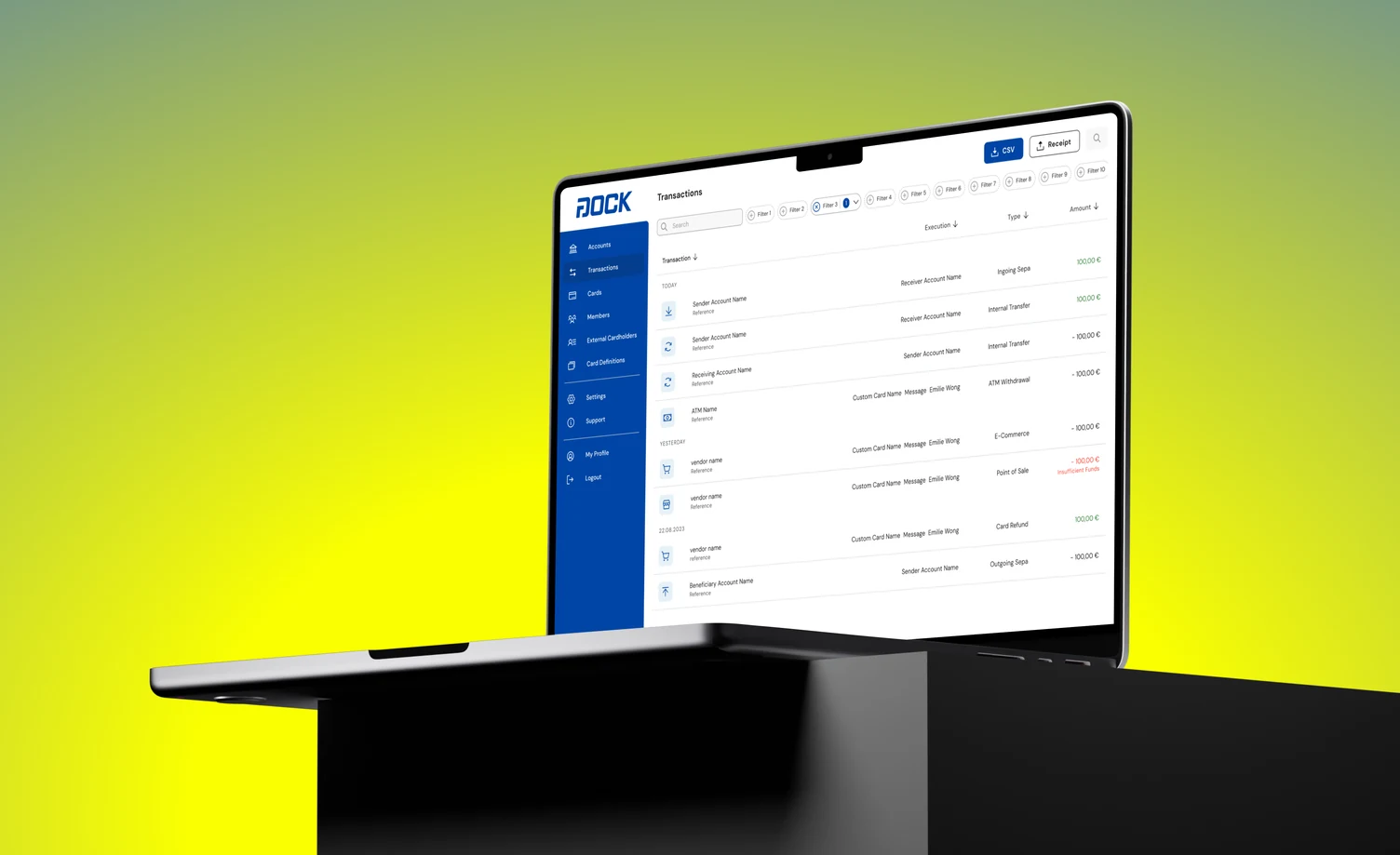
Dock Financial transactions interface shown on a laptop
Embedded finance, made monitorable. Accounts, transactions, cards and cardholders in one console — the surface enterprise clients actually operate.

/01 — the situation

Fragmented across tools and teams.

The existing workflows were spread across multiple tools and teams, creating bottlenecks that slowed delivery and inflated production expenses. A merger multiplies that problem: two of everything, and customers on both sides.
75%less production time
82%less production cost
2companies unified
1design system
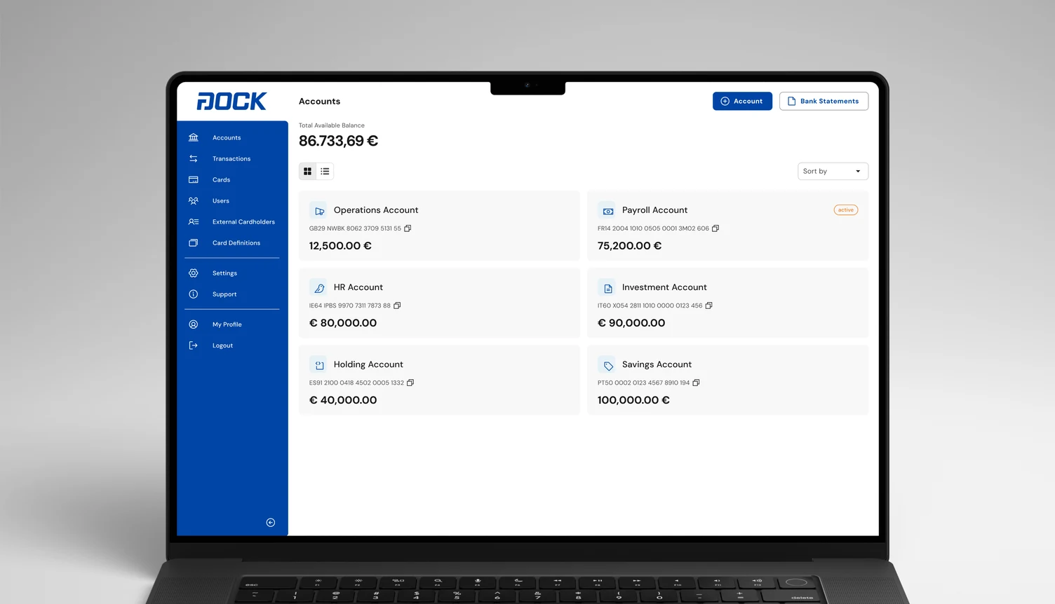
Accounts overview showing operations, payroll, HR, investment, holding and savings accounts with balances and IBANs
Not one balance — a structure. Enterprise customers run operations, payroll, HR, investment, holding and savings accounts side by side, so the overview is the product’s real home screen.
FLOW 01 — ACCOUNT MONITORING3 FLOWS · GUIDED TOUR · YOURS TO DRIVE
LOADING PROTOTYPE
1.1Guided tour — loading…
The operator's home screen. Scope by tenant, widen to sub-tenants, filter to the accounts compliance has to clear — one table, never a second screen.

The brief was not a redesign. It was to ensure a successful merge at product level — unify two companies under one design system, reduce product development time and cost, and bring the services together.

/02 — the approach

A design system built to be used, not admired.

I designed a ready-to-use design system that cut implementation complexity sharply, automated production, and standardised the dashboards used for financial monitoring.

The measure of a system like this is not how complete the library looks. It is how much cheaper the next screen is than the last — which is why the outcome is stated in production time and cost rather than in component counts.

Client onboarding was streamlined in the same pass: the integration process for enterprise customers is part of the product, not a document handed over after signature.
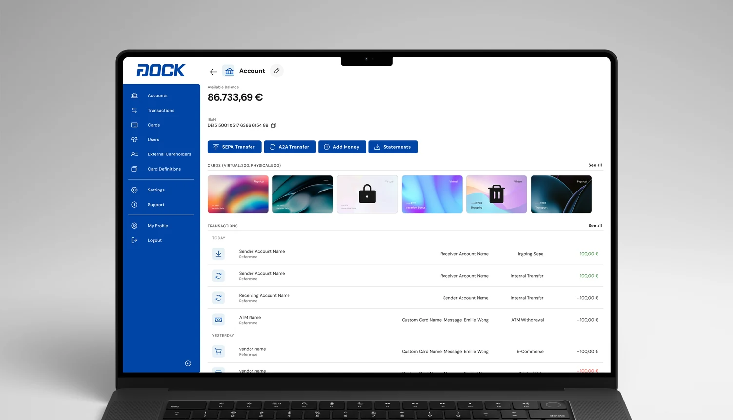
Account detail view with balance, IBAN, SEPA and A2A transfer actions, a card gallery and a transaction ledger
One screen, four jobs. Balance and IBAN, the four money-movement actions, the cards issued against the account, and the transaction ledger beneath — assembled entirely from system components.
FLOW 02 — CARD LIFECYCLE2 FLOWS · GUIDED TOUR · YOURS TO DRIVE
LOADING PROTOTYPE
1.1Guided tour — loading…
Issuing is monitoring. A card is created from the screen that watches it, and inherits its rules from the definition rather than a second form.
DECISION

Ship a system, not a style guide

One reusable system that produces screens, rather than documentation that describes them.

CHOSE
A ready-to-use design system driving production
OVER
A visual refresh applied per product after the merge
COST
Everything downstream is coupled to the system — it has to hold for both companies at once
[FILL] — PROCESS & SCREENSProduct screens, flows and process artefacts for this case. The live site has a screenshot set; higher-resolution versions and one before/after belong here.

/03 — one product, many brands

Brand as a parameter, not a fork.

Embedded finance means the bank stack shows up wearing somebody else’s name. The design system had to make identity a setting — colour, logo, card artwork, language — without any screen being redrawn for it.
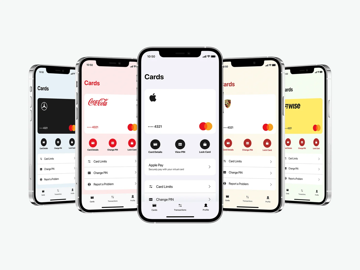
The same mobile Cards screen rendered under five different brand identities
The same screen, five identities. Layout, hierarchy and controls are fixed; only the theme moves. Brand demonstrations rather than named customers — the point is that nothing beneath the paint changes.
FLOW 04 — PARTNER MODE3 FLOWS · GUIDED TOUR · YOURS TO DRIVE
LOADING PROTOTYPE
1.1Guided tour — loading…
Brand as a parameter. Switching tenant re-badges the same console; roles stay scoped to the tenant, and height in the tree grants nothing by itself.
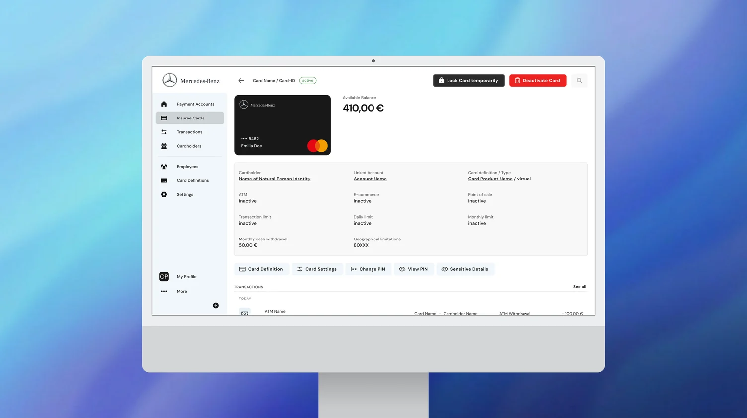
White-label card management console rendered in a customer brand identity
The console under a brand. Card status, limits, ATM, e-commerce and point-of-sale toggles, geographic restrictions — the operator’s surface, themed.
FLOW 03 — AUTHORISATION & VELOCITY3 FLOWS · GUIDED TOUR · YOURS TO DRIVE
LOADING PROTOTYPE
1.1Guided tour — loading…
Where the product is regulated, not decorated. Channels, velocity limits and the 0.00 € authorisation case that silently declines cards at fuel pumps.
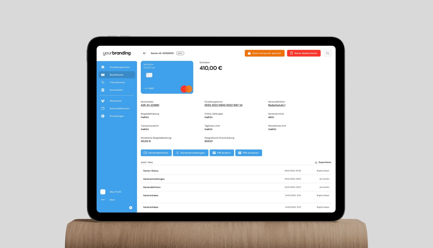
Card detail screen in German under a placeholder brand, showing an audit trail of changes with timestamps and user names
Theming and localisation are the same problem. A placeholder identity in German, with the audit trail carrying who changed what and when — the requirement that turns a fintech console into something a regulated business can actually operate.

This is where a design system stops being a convenience and becomes the product’s commercial model: every new brand is configuration, not a project.

/04 — in the hand

The cardholder never sees the console.

The other half of embedded finance is the person holding the card. That app carries a different job entirely — check a balance, freeze a card, approve a payment, find a receipt — and it has to do it under whatever brand issued the card.
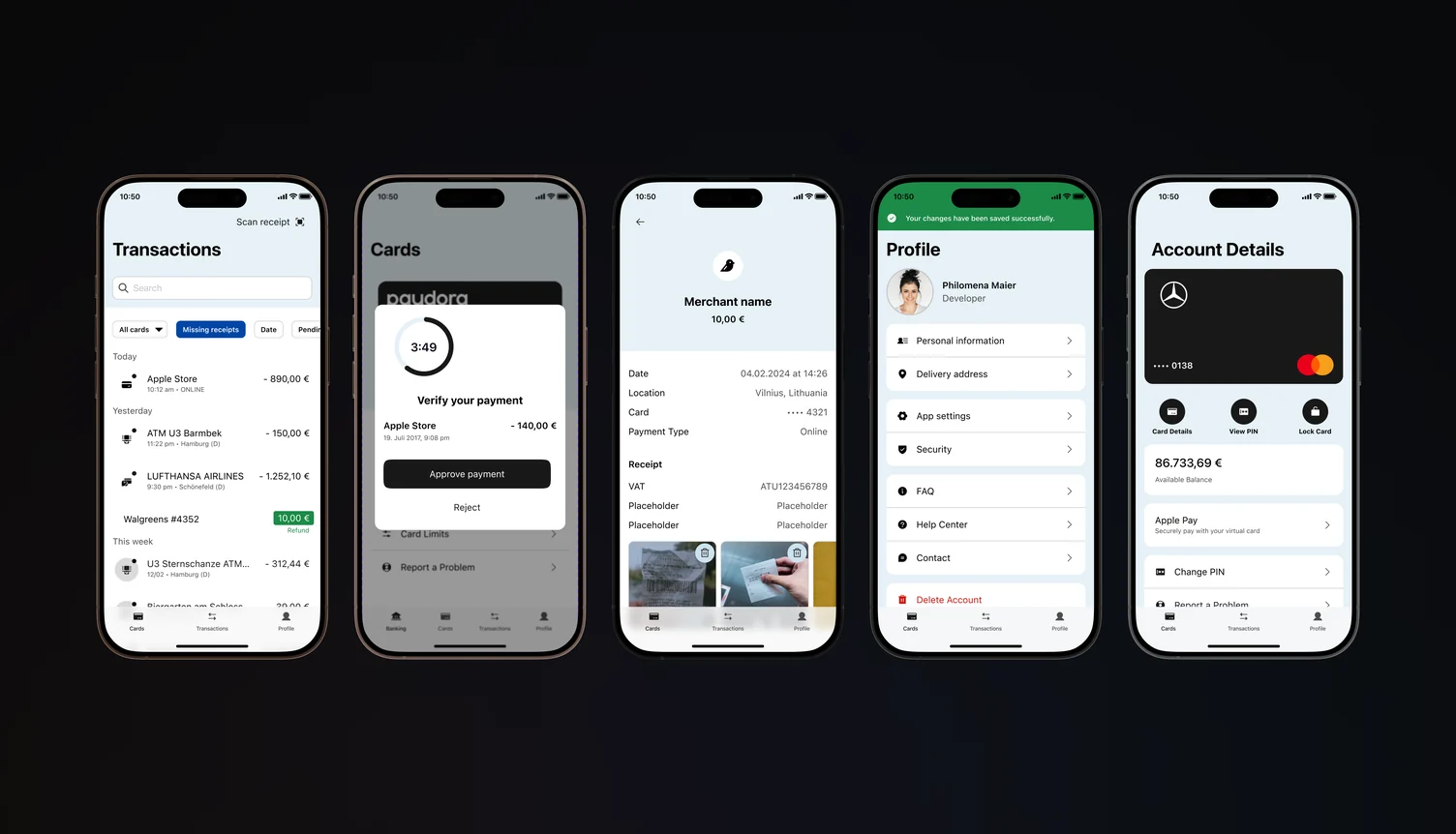
Mobile app screens for transactions, payment approval with a countdown, receipt detail, profile and account details
Four flows that have to be fast. Transaction search with a missing-receipt filter, payment approval on a countdown, receipt capture attached to the transaction, and card controls one tap from the account.
FLOW 05 — PAYMENT APPROVALGUIDED TOUR · YOURS TO DRIVE
LOADING PROTOTYPE
1.1Guided tour — loading…
The flow with a clock on it. The countdown is the authorisation window — every other element exists to make one decision inside it.
FLOW 06 — MISSING RECEIPTGUIDED TOUR · YOURS TO DRIVE
LOADING PROTOTYPE
1.1Guided tour — loading…
Capture on the transaction. Filter to missing receipts, scan, and the VAT lands against the payment it belongs to — never the wrong one.

Payment approval is the flow with a clock on it: the timer is not decoration, it is the authorisation window, and everything else on that screen exists to make the decision inside it.

/05 — outcome

A merger absorbed at product level.

  • 75% reduction in production time
  • 82% reduction in production costs
  • Faster client onboarding and a clearer monitoring UX
  • Simplified design system, improved scalability

[FILL] What would be done differently, and the honest failure or reversal from this project.